Mobile-First Design: Why It's Critical for Small Business Success in 2026 (And How AI Makes It Easy)
Sandeep Bhondwe
Professional Website Developer & AI Solutions Expert
📱 Introduction: The Mobile Tsunami
Did you know that over 60% of all website traffic now comes from mobile devices? In some industries, that number jumps to over 80%. Yet, nearly 40% of small business websites are still not optimised for mobile — and they are bleeding customers every single day.
Of all global web traffic now originates from smartphones and tablets.
Users are 5 times more likely to leave a site that isn't mobile-friendly within the first 5 seconds.
In 2026, mobile-first isn't just a buzzword — it's a survival strategy. If your website doesn't look and perform flawlessly on a smartphone, you are losing potential customers to competitors who invested in a responsive design.
“But building a mobile-optimised website used to be expensive and time-consuming — until AI changed the game.”
🤖 The AI Advantage: Mobile-First, Effortlessly
As a freelance web designer, I've stopped worrying about writing separate code for desktop and mobile. With the power of AI, every website I create is automatically responsive — no extra effort, no hidden costs.
AI tools handle the complex CSS media queries, flexible grids, and touch-optimised interactions in real time. This means I can focus on creating beautiful, brand-centric designs while the AI ensures they work perfectly on every screen size — from a 6-inch phone to a 32-inch monitor.
“AI doesn't just build websites — it builds experiences that adapt to every user, on every device, instantly.”
🏋️ Case Study: “FitPro” – A Gym & Fitness Studio Website
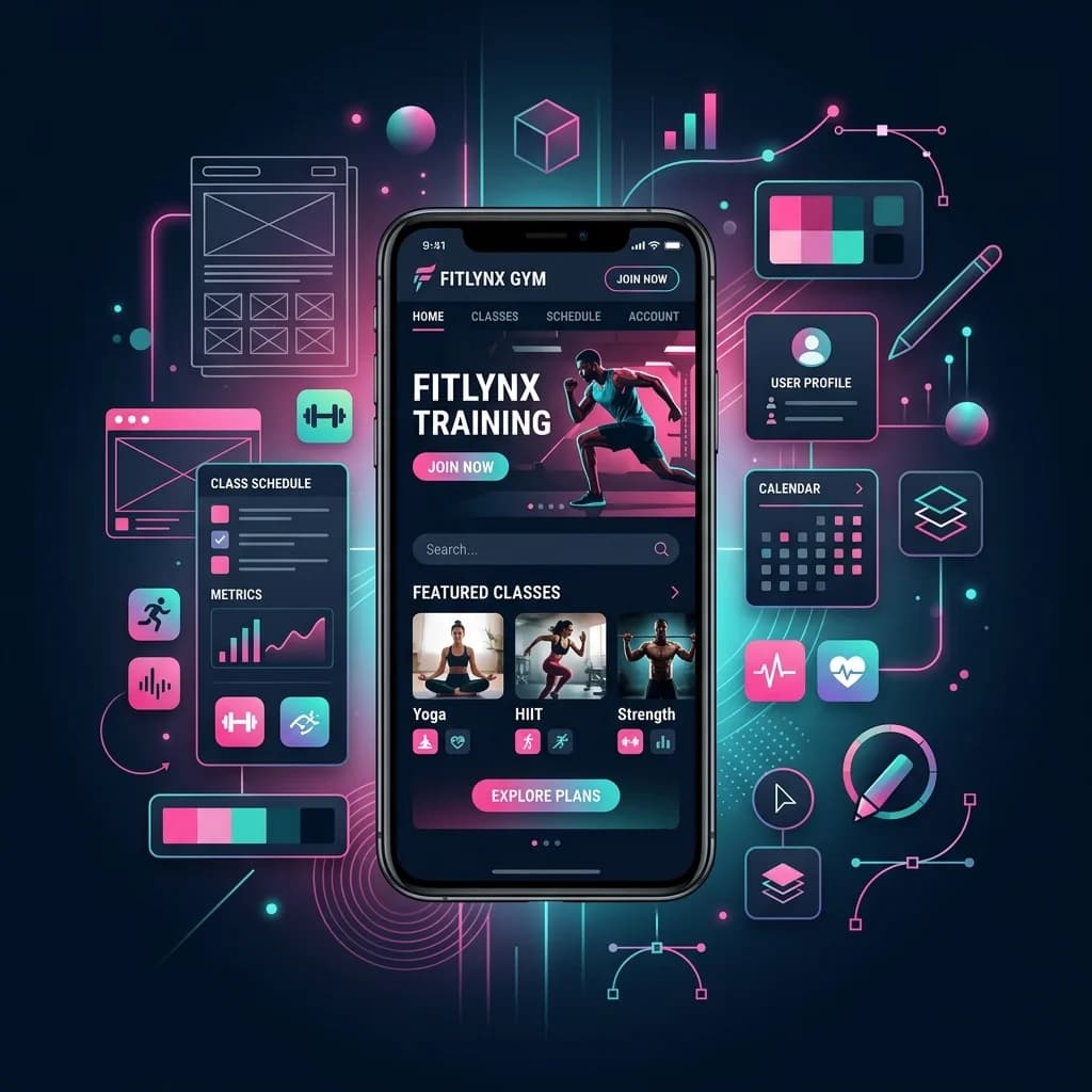
To demonstrate the power of AI-driven mobile-first design, let me introduce you to one of my recent demo projects: FitPro, a modern fitness studio website built with mobile users at the centre of every decision.
The Goal:
The client — a fast-growing gym chain — needed a website that would convert mobile visitors into trial memberships. Over 75% of their target audience (young professionals aged 22–40) browses on their phones during commutes or lunch breaks. The site had to load instantly, look stunning, and make booking a trial class effortless — all on a small screen.
The AI-Powered Solution:
Using AI, I built a fully responsive, conversion-focused website that delivers a flawless experience on every device:
Thumb-Friendly Navigation
All buttons and touch targets are sized for thumbs (minimum 44px), making one-handed browsing effortless.
Optimised Visual Hierarchy
Class schedules, trainer profiles, and membership plans are prioritised above the fold, exactly where mobile users expect them.
Lightning-Fast Load Times
AI-optimised assets and lazy loading ensure the site loads in under 2 seconds on 4G networks — critical for user retention.
One-Tap Trial Booking
A streamlined booking flow with auto-filled fields and calendar integration makes signing up for a free trial a breeze.
Tap-to-Call & Tap-to-Navigate
Location and phone number are integrated with native device actions — one tap calls the gym, another opens Google Maps for directions.
Social Proof at a Glance
Mobile-optimised testimonials and star ratings are displayed prominently to build trust instantly.
🔥 Why Mobile-First Matters for Your Business
Whether you run a gym, a café, a dental clinic, or an online store, here's how a mobile-first website impacts your bottom line compared to a desktop-only or poorly optimised site:
💡 My Promise to You
I believe that every business — no matter how small — deserves a website that works flawlessly on every device. You shouldn't have to choose between a stunning desktop design and a functional mobile experience.
With AI, I give you both — without compromising on quality, speed, or budget. No coding expertise required. No expensive agency markups.
Ready to Go Mobile-First?
Your customers are on their phones right now. Make sure your website captures their attention and converts them into loyal customers.
Let's build a mobile-first website that drives real results. No coding. No stress. Just results.